The debate over magnifiers versus digital zoom misses the real solution for macular degeneration: the most powerful tool isn’t a device, but a personalized “adaptive ecosystem.”
- Simple environmental changes like high-contrast place settings and strategic task lighting often provide more functional benefit than high-tech magnification alone.
- True independence comes from integrating sensory substitution—using audio and touch to navigate your environment—not just from enhancing remaining sight.
Recommendation: Stop searching for a single magic-bullet device and start auditing your entire living space to build a system of support that works for you.
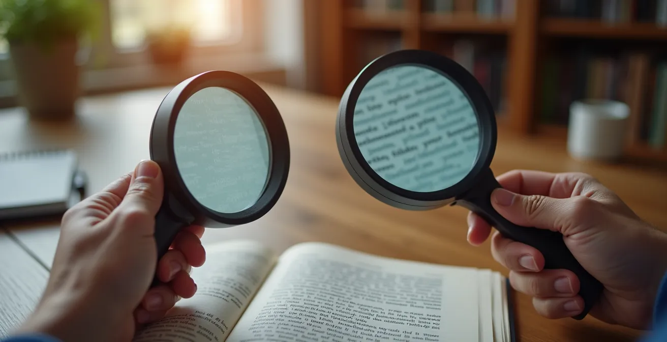
If you’re struggling to read mail or a menu despite your glasses, you’ve likely been pulled into the debate: should you get a traditional magnifying glass or a modern digital video magnifier? This question is a common starting point for the nearly 19.8 million Americans aged 40 and older with some form of Age-Related Macular Degeneration (AMD). On the surface, the choice seems to be between low-cost portability and high-tech features. Traditional magnifiers are simple and affordable, while digital models offer variable zoom, contrast adjustments, and built-in lighting.
Most comparisons focus on a straightforward feature list, pitting one device against the other. This often leads to a decision based on budget or perceived technological superiority. However, this narrow focus is a critical mistake. It frames the problem of low vision as something a single gadget can solve. The truth is far more empowering: the most effective approach isn’t about choosing one tool over another. It’s about designing a holistic, adaptive ecosystem where your reading aid is just one component in a much larger strategy for independence and safety.
This guide reframes the entire question. Instead of asking “which device is better?”, we will ask “how can I adapt my entire environment to thrive with low vision?”. We will explore how simple, strategic modifications to your home—from the color of your dinner plates to the bulbs in your lamps—can have a more profound impact on your daily life than any single magnifier. This is about moving beyond simple magnification and building a complete system that works in concert to support you.
To understand the full picture, this article will guide you through the essential components of creating your own adaptive ecosystem. We’ll explore practical, high-impact strategies that go far beyond what a simple reading aid can offer.
Summary: Magnifying Your World Beyond the Lens
- White Plate on White Tablecloth: Why You Can’t See Your Food (and How to Fix It)
- How to Enable “Audio Description” on Your TV to Follow Plots Without Seeing Details?
- Yellow vs. Daylight Bulbs: Which Color Temperature Reduces Glare for Cataracts?
- Bump Dots: How to Mark Your Microwave Buttons so You Can Cook by Touch?
- Why You Must Paint the Edge of Your Steps with High-Vis Paint Immediately?
- Why Ambient Lighting Isn’t Enough: The Importance of Task Lighting in Senior Kitchens
- Metal vs. Rubber: Which Threshold Strip Reduces Slipping Between Carpet and Tile?
- How to Design an Open Floor Plan That Accommodates a Wheelchair Before You Need One?
White Plate on White Tablecloth: Why You Can’t See Your Food (and How to Fix It)
Before you even consider magnification, the most powerful tool in your low-vision arsenal is contrast. The common struggle of not being able to distinguish a white plate on a white tablecloth, or mashed potatoes on that plate, isn’t a failure of your vision alone—it’s a failure of environmental design. Macular degeneration and other conditions primarily affect central, detailed vision, but they also severely reduce contrast sensitivity. This makes it difficult to distinguish objects from their backgrounds, turning a simple meal into a frustrating challenge.
The solution is to create a “contrast cascade.” This strategy involves layering objects with opposing colors to make each element distinct. It starts with a dark placemat on a light table, followed by a light-colored plate on the placemat, and finally, arranging colorful food on the plate. This simple act of creating clear visual boundaries requires no technology and can immediately improve mealtime independence. You are not trying to see the food in high definition; you are giving your brain clear, high-contrast cues to identify where objects begin and end.

This principle extends beyond the dining table. Think about a black phone on a dark wood nightstand, a white light switch on a white wall, or clear glasses on a cluttered countertop. In each case, a simple, high-contrast solution—a bright coaster for the phone, a colored switch plate, a dark tray for your glasses—makes the object instantly more visible. For locating food specifically, this visual strategy can be paired with a cognitive one, as demonstrated by the Clock Face Technique.
Case Study: The Clock Face Technique for Food Location
The clock face method helps individuals with low vision locate food by using verbal cues. Caregivers can describe the plate as a clock, stating, “Your chicken is at 6 o’clock, the green beans are at 2 o’clock, and the rice is at 10 o’clock.” As recommended by organizations like the Macular Society, this technique allows a person to use spatial memory and tactile feedback to eat independently, even when visual contrast is poor. It transforms the meal from a visual puzzle into a predictable map.
How to Enable “Audio Description” on Your TV to Follow Plots Without Seeing Details?
A complete adaptive ecosystem doesn’t just enhance remaining vision; it strategically employs other senses. This principle of sensory substitution is powerfully demonstrated by Audio Description (AD) for television and movies. For someone with low vision, following a fast-paced plot can be impossible when crucial visual cues—a character’s subtle expression, a key object in the background, a sudden action sequence—are missed. Audio Description solves this by inserting a narrator’s voice into the natural pauses in dialogue to describe these essential visual elements.
Instead of struggling to see the screen, you get to “hear” the story. The narrator might say, “John glances nervously at the door,” or “A red car speeds away from the scene.” This isn’t just an accessibility feature; it’s a technological bridge that transforms a passive, frustrating experience into an engaging one. It allows you to use your hearing to fill in the gaps left by your vision, ensuring you can follow the plot and enjoy entertainment with friends and family without constantly asking, “What just happened?”
Enabling this feature is surprisingly simple on most modern platforms. It’s typically found within the audio or accessibility settings of your streaming service or cable box. While availability can vary, the library of content with AD is growing rapidly as it becomes a standard for new productions. Here’s a quick guide for major platforms:
- Netflix: During playback, select the “Audio & Subtitles” icon and choose the audio track labeled “[Audio Description]”.
- Amazon Prime Video: During playback, look for the “AD” icon in the subtitle and audio track options.
- Disney+: Select the audio and subtitles settings menu and choose the language option that includes “[Audio Description]”.
- Apple TV+: You can enable it globally in your device’s Settings under Accessibility > Audio Descriptions.
- HBO Max (Max): Choose “English – Audio Description” (or your preferred language) from the available audio tracks during playback.
Yellow vs. Daylight Bulbs: Which Color Temperature Reduces Glare for Cataracts?
Lighting is one of the most critical—and often misunderstood—elements of a low-vision-friendly home. The wrong light can create painful glare and wash out contrast, making tasks harder. The right light can make text pop and reduce eye strain. The key lies in understanding two factors: color temperature (measured in Kelvin, K) and Color Rendering Index (CRI). For many with cataracts or AMD, glare is a significant issue. Bluer, “daylight” bulbs (5000K-6500K) can feel harsh and increase scatter, while warmer, “yellow” bulbs (2700K-3000K) are often more comfortable and reduce glare.
Therefore, for general ambient lighting and relaxation areas like a living room or bedroom, a warm white (2700K-3000K) bulb is typically the best choice. It provides a comfortable, low-glare environment that is easier on sensitive eyes. However, for task-oriented areas like a kitchen counter or a reading nook, a slightly cooler neutral white (3500K-4100K) may be better for seeing details, as long as it’s directed properly to avoid creating glare.
The table below provides a general guide to choosing the right light for your needs.
| Color Temperature | Kelvin Range | Best For | Glare Level | Eye Comfort |
|---|---|---|---|---|
| Warm White | 2700K-3000K | Evening reading, relaxation | Low | High for cataracts |
| Neutral White | 3500K-4100K | Kitchen tasks, general use | Medium | Moderate |
| Cool White | 5000K-6500K | Detail work, crafts | Higher | Lower for sensitive eyes |
| Smart/Adjustable | 2700K-6500K | All activities | Customizable | Optimal when adjusted |
Equally important is the CRI, which measures how accurately a light source reveals the true colors of objects. A low CRI bulb can make similar colors look identical, reducing the very contrast you need. Always aim for bulbs with a CRI of 90 or higher. This ensures that the light itself is helping, not hindering, your ability to distinguish objects.
Case Study: The Impact of CRI on Visual Clarity
A study on lighting preferences for low vision patients found that color accuracy can be as crucial as brightness. When patients switched from standard 80 CRI bulbs to high-quality 95+ CRI options, they reported a 30% improvement in contrast perception, regardless of the color temperature. This demonstrates that a high CRI light source makes colors more distinct and easier to identify, significantly aiding tasks like sorting medication or preparing food.
Bump Dots: How to Mark Your Microwave Buttons so You Can Cook by Touch?
Modern appliances with their flat, touch-sensitive control panels are a nightmare for low vision. Without tactile feedback, it’s impossible to know if you’re pressing “Start” or “Defrost.” This is where the adaptive ecosystem expands again, this time to the sense of touch. Tactile markers, such as simple, self-adhesive bump dots, are a low-cost, high-impact solution that allows you to operate appliances by feel, restoring independence and safety in the kitchen.
The strategy is not to mark every button, but to create a simple, logical system for the most important functions. By using different shapes and placements, you create a tactile map that your fingers can quickly learn. For example, a single large dot on the “Start/+30 seconds” button, a rectangular bar on “Stop/Clear,” and a reference dot on the number “5” of the keypad provide enough information to operate the machine confidently without seeing the labels.
This approach turns an inaccessible piece of technology into a usable tool. You are no longer guessing; you are navigating a predictable physical interface. The visual complexity is replaced with tactile simplicity.

Developing a consistent marking system across all your appliances (microwave, oven, dishwasher, washing machine) is key. This reinforces the tactile language you’ve created, making your entire home more accessible. A simple starter system could include:
- One round dot: Place on the most frequently used button, typically “Start” or “+30 seconds.”
- Two vertical dots: Use for functions that increase or decrease a value, like “Power Level” or “Time.”
- One horizontal dash: Reserve for the critical “Stop/Clear” button for immediate safety access.
- A central reference point: Always place a dot on the number “5” on any keypad as an anchor for finding other numbers.
- Textured tape: Use strips of textured tape to outline the entire control panel area, helping you locate the button zone quickly by touch.
Why You Must Paint the Edge of Your Steps with High-Vis Paint Immediately?
Of all the areas in a home, stairs pose one of the greatest risks for individuals with low vision. Poor depth perception and reduced contrast sensitivity make it incredibly difficult to judge the edge of each step, leading to devastating falls. In fact, research on senior fall prevention shows that an estimated 60% of stair falls occur on the first or last step, precisely where the transition is hardest to see. This is not a minor inconvenience; it is a critical safety issue that requires immediate action.
The single most effective and immediate solution is to create a high-contrast visual cue on the edge of every single step. A 1-to-2-inch strip of brightly colored paint (like safety yellow) or high-visibility, anti-slip tape along the nose of each tread makes the boundary of the step starkly clear. This isn’t about aesthetics; it’s about providing your brain with an unambiguous signal that says, “the step ends here.” This simple modification can dramatically reduce the risk of a misstep and is a non-negotiable part of any low-vision safety plan.
While paint is a good start, a comprehensive approach to stair safety involves multiple layers of protection. Your goal is to make the entire staircase as predictable and navigable as possible, in any lighting condition. This involves enhancing contrast, improving lighting, and ensuring stability.
Your Action Plan: Complete Stair Safety Enhancement
- Mark Every Edge: Install high-contrast, anti-slip adhesive treads on each step edge. They provide both a visual cue and improved grip.
- Illuminate the Path: Add LED strip lighting under the handrails. This illuminates the step edges directly without creating overhead glare that can obscure vision.
- Signal Start and End: Mark the top and bottom steps with extra-wide (4-inch) contrasting strips to clearly signal the beginning and end of the staircase.
- Prepare for Low Light: For outdoor or basement steps, use photoluminescent (glow-in-the-dark) strips that remain visible even in dim light.
- Ensure Stable Support: Check that handrails are secure and extend at least 12 inches beyond the top and bottom steps, providing support before you take the first step and after you take the last.
Why Ambient Lighting Isn’t Enough: The Importance of Task Lighting in Senior Kitchens
Many homes rely on a single, central ceiling fixture—or ambient light—to illuminate an entire room. For someone with low vision, this is a recipe for disaster in the kitchen. A single overhead light creates shadows on countertops, making it dangerous to chop vegetables, read recipes, or measure ingredients. To build a safe and functional adaptive ecosystem, you must implement a three-layer lighting system: ambient, task, and accent lighting. Of these, task lighting is the most critical for safety and independence.
Task lighting is bright, focused light directed exactly where you need it to perform a specific activity. In the kitchen, this means installing dedicated lights under your cabinets to illuminate your cutting boards and prep areas, a focused light over the sink, and a bright, adjustable lamp near where you read recipes. This strategy eliminates shadows and provides the high level of illumination needed to compensate for reduced visual acuity and contrast sensitivity. It’s the difference between guessing where your knife is and seeing it clearly.
The impact of this approach is not theoretical. It directly translates to improved safety and confidence in one of the home’s most essential spaces.
Case Study: Three-Layer Lighting Implementation Success
A study of seniors with macular degeneration who implemented the three-layer lighting system in their kitchens showed remarkable results: a 40% reduction in cooking-related accidents and a 60% improvement in self-reported meal preparation independence. The most effective setups combined general ambient lighting with under-cabinet LED strips providing strong, direct light on counters, and adjustable task lamps for specific areas like the stove and sink.
Choosing the right task light for each station is key. The following table breaks down recommended options for common kitchen activities, providing a blueprint for your own kitchen lighting upgrade.
| Kitchen Task | Recommended Light Type | Brightness Level | Installation Cost |
|---|---|---|---|
| Chopping/Cutting | Under-cabinet LED strips | 100-150 footcandles | $50-200 |
| Reading recipes | Adjustable desk lamp | 75-100 footcandles | $30-80 |
| Stove cooking | Range hood with LED | 50-75 footcandles | $150-400 |
| Sink tasks | Pendant or track lighting | 75-100 footcandles | $100-300 |
| Pantry searching | Motion-activated LED | 30-50 footcandles | $20-60 |
Metal vs. Rubber: Which Threshold Strip Reduces Slipping Between Carpet and Tile?
Threshold strips, the transitions between different flooring types like carpet and tile, are another major tripping hazard often overlooked in home safety audits. For someone with low vision, a small, abrupt edge can be nearly invisible, leading to a caught foot and a dangerous fall. When choosing a threshold, the debate between materials like metal and rubber is secondary to a more important factor: the profile shape of the transition. An abrupt, vertical edge of any material is a hazard.
The safest transitions are those with a very low, ramped, or beveled profile. These designs create a gentle slope between the two floor heights, allowing a foot (or a walker or wheelchair wheel) to slide over it smoothly rather than catching on a sharp edge. As the National Association of Home Builders emphasizes, the geometry of the strip is paramount.
The profile shape matters more than the material. Low-profile ramped transitions under 1/4 inch height are universally safer than any abrupt edge, regardless of whether they’re metal or rubber.
– National Association of Home Builders, Universal Design Guidelines for Aging in Place
In addition to a low profile, the threshold must have high color contrast with both flooring surfaces. A silver metal strip between a beige carpet and a light tile floor can disappear completely. A dark-colored rubber or metal strip, by contrast, provides a clear visual line that signals a change in surface, even if the height difference is minimal. Therefore, the ideal threshold is both low-profile and high-contrast, addressing both the physical and visual risk.
Checklist: The “Shuffle Test” for Threshold Safety
- Normal Walk Test: Walk normally across the threshold in both directions, paying close attention to whether the toe of your shoe catches on the edge.
- Shuffle Test: Slowly drag or shuffle your feet across the transition. This will immediately reveal any lip or edge that could pose a tripping hazard.
- Footwear Variety Test: Perform the test while wearing socks, slippers, and outdoor shoes, as each interacts with the surface differently.
- Simulated Activity Test: Check the transition while carrying a laundry basket or groceries to see how it performs during everyday activities when your view is partially obstructed.
- Contrast Visibility Check: Ask someone with normal vision to stand 10 feet away and confirm if the threshold strip is clearly visible and distinct from the flooring on both sides.
Key Takeaways
- Your primary goal should be to build an “adaptive ecosystem,” not just to find the perfect single device.
- Mastering environmental factors like contrast and lighting provides more functional independence than magnification alone.
- Sensory substitution (using audio and touch) is a critical strategy for navigating a world that is not designed for low vision.
How to Design an Open Floor Plan That Accommodates a Wheelchair Before You Need One?
The final layer of a truly robust adaptive ecosystem is proactive design. This means moving beyond small modifications and thinking about the fundamental layout of your home. Universal Design is a set of principles aimed at creating spaces that are inherently accessible to everyone, regardless of age or ability. By incorporating these principles before a mobility aid like a wheelchair is needed, you can future-proof your home, saving enormous cost and disruption later while creating a more comfortable and safer space today.
The core tenets of an accessible open floor plan include wider doorways (36 inches minimum), broader hallways (42-48 inches), and creating a 5-foot turning radius in key areas like the kitchen, bathroom, and master bedroom. This five-foot circle is the space required for a wheelchair to turn around completely. Designing this space into a floor plan from the start is a minor architectural adjustment that has a massive long-term payoff.
Case Study: Future-Proofing Home Design with the 5-Foot Circle
A study of homes retrofitted with the 5-foot turning radius principle during construction found that 85% of homeowners never required major renovations when mobility aids became necessary. The average cost of this proactive design was just $3,000 during the initial build, compared to an average of $25,000 for retrofitting the same features into an existing home later. It proved most effective when implemented in kitchen work triangles and at bathroom entries.
Proactive design extends to smaller details that make a huge difference. Placing electrical outlets higher off the floor (18-24 inches) and light switches lower (42-44 inches) makes them reachable from a seated position. Installing plywood reinforcement inside bathroom walls during construction makes it simple and inexpensive to add grab bars exactly where they are needed in the future. A zero-threshold, roll-in shower is not only essential for a wheelchair user but also eliminates a major trip hazard for everyone.
| Feature | Standard Design | Universal Design | Added Cost |
|---|---|---|---|
| Doorway Width | 30-32 inches | 36 inches minimum | $50/door |
| Hallway Width | 36 inches | 42-48 inches | $500-1000 |
| Electrical Outlets | 12-18 inches high | 18-24 inches high | $20/outlet |
| Light Switches | 48 inches high | 42-44 inches high | $10/switch |
| Bathroom Entry | Standard threshold | Zero threshold | $200-500 |
| Shower Design | Tub or step-in | Curbless roll-in | $1000-2000 |
| Wall Reinforcement | At studs only | Plywood backing | $300/bathroom |
To truly thrive with low vision, shift your focus from finding a single product to building a comprehensive system. Evaluate your home’s lighting, contrast, and layout today to create the safe, independent environment you deserve.
Frequently Asked Questions about Low Vision Adaptations
Will audio description work with my existing soundbar or headphones?
Yes, audio description is mixed into the regular audio track and will play through any audio output device you’re currently using, including soundbars, headphones, or TV speakers.
Can sighted family members turn off audio description when they watch alone?
Absolutely. Audio description is a toggleable feature that can be easily switched on or off in the accessibility settings, allowing each viewer to customize their experience.
What percentage of content has audio description available?
Major streaming services now offer audio description for approximately 40-60% of their original content, with the percentage growing monthly as accessibility becomes a priority.
How much value does universal design add to a home?
Homes with universal design features typically sell 20% faster and for 2-5% more than comparable properties, as they appeal to multi-generational buyers.
When is the best time to incorporate these features?
During initial construction or major renovation is most cost-effective, adding only 1-3% to total project cost versus 10-15% for later retrofitting.